
Color is a fundamental characteristic of our world; science defines this phenomenon as electromagnetic radiation that travels in waves. We can only see a small section of this spectrum (Per NASA—380 to 700 nanometers), and its different wavelengths correspond to specific colors. For instance, we perceive shorter ones as violet/blue, while longer waves are red. Consequently, color is a type of energy that affects us in various ways.
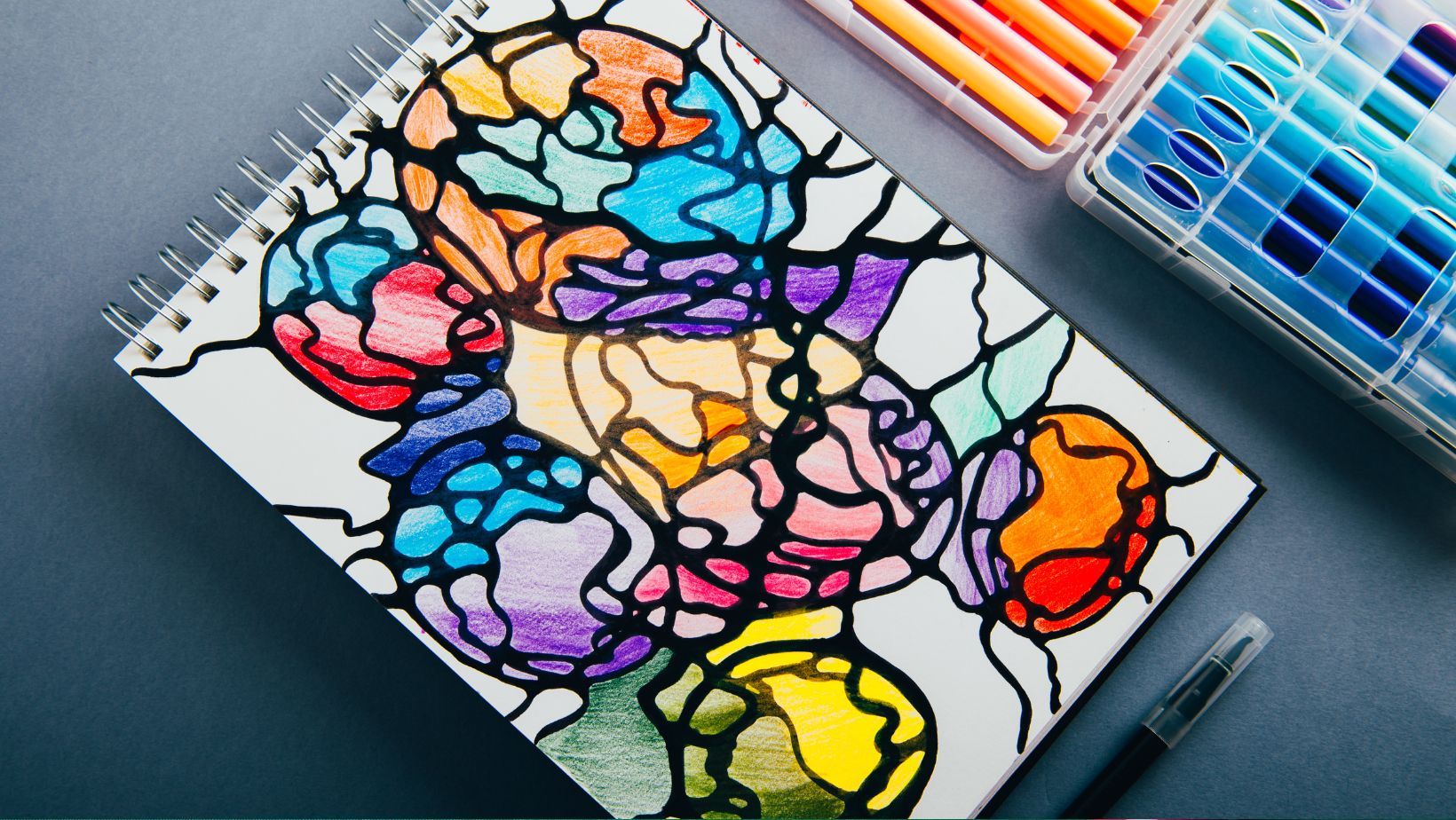
Color theory is a framework of guidelines that aims to create aesthetically pleasing combinations of colors for effective visual communication. It is a field that is getting ever-growing adoption, encompassing science and psychology to help people relate ideas better.
Without question, colors influence people on a conscious and subconscious level. They communicate things we are unaware they do, which can increase blood pressure and boost metabolism. We cannot even comprehend how many times during the day we make decisions based on how colors have affected us at a given moment, and in this article, we explore that in more detail.
The Psychology of Color
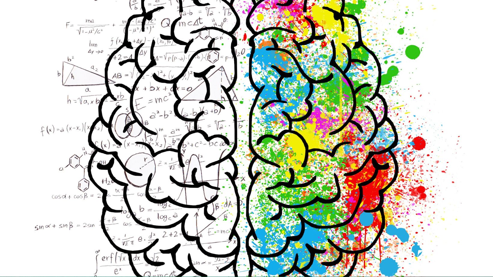
As most children are taught in biology class, the human eye has two receptor cells in its retina: rods and cones. The first enables low-light vision conditions, but they do not detect colors. The latter are responsible for perceiving hues. There are three types of cones, and the brain interprets signals from these to see colors via a process known as additive color mixing, which factors in lighting conditions and color constancy.
Over human evolution, we have developed various mechanisms that ensure our survival that involve color. These include eliciting physiological responses to different colors, with many of these triggers stemming from inherent abilities that humans have attained in distinguishing ripe fruits or spotting predators lurking in the environment.
Hence, these instincts have been the basis for our color-based emotional associations. Warms stimulate enthusiasm and passion, and cooler hues promote relaxation and peace. Moreover, bright and high-contrast colors attract attention and improve memory retention. That is why red gets used in warning signs, ads, and even roulette, where it gets contracted with black to distinguish the numbered pockets on gaming tables. However, these days, due to the simplicity of how to find live roulette casino sites, most people gamble on this game remotely. Fast food restaurants are also fans of red, and they like to pair it with yellow to stimulate appetite and encourage quick dining because it relates to urgency.

Naturally, different cultures have also created their unique links with distinct colors. Green has a religious meaning in Islam, symbolizing paradise and peace, while white, in Eastern cultures, is associated with mourning, symbolizing death and the afterlife.
Application of Color in Marketing, Design, and Art
Building a strong brand identity is mandatory for business success for service and product providers. It helps entities stand out and be instantly recognizable. To do this successfully, companies look to match what they do and what they want to convey with a specific color that best emphasizes this. Accordingly, Netflix has chosen red for its logo to convey excitement and energy. However, a finance company like PayPal has opted for blue, which relays a sense of reliability.
Bright colors make products stand out. They make them more eye-catching, which is why they get utilized in snack foods and beverages, whose producers often look to color code to indicate the flavor of a product through its color. Marketers also like to use black, gold, and silver in packaging design to convey luxury and premium quality since these correlate with precious metals. Green is the preferred choice for eco-friendly and health-conscious things that aim to convey tranquility and attract environmentally conscious consumers.
Many principles discussed here are also exploited in user interface/experience design. Visual artists and fashion designers, too, play with color to build emotional engagement and tie it to various aspects of life to evoke specific feelings.
Historical Perspectives on Color and Emotion
As noted above, individual groups have created beliefs about color and different bonds with certain ones. The ancient Egyptians thought that some held intrinsic powers, and they implemented distinct ones in their religious artifacts to convey particular messages. An instance of this is the god Osiris, usually painted in green, which the Egyptians associated with fertility/rebirth.
On the other hand, the Greeks theorized that colors came from a blend of light and darkness. Aristotle’s philosophical theory suggested that white, the absence of darkness, was the purest form of color. Though his ideas were somewhat elementary by modern standards, he laid out an understanding of the nature of color that affected how people think about and process it.
It is vital to add that a landmark book on this topic is Johann Wolfgang von Goethe’s Theory of Colours, which challenged Newton’s physical explanation of color, going more into how it impacts behaviors. Published in 1810, Zur Farbenlehre (its German title) explained phenomena like refraction, colored shadows, and chromatic aberration while also supplying novel and peculiar insights. One was the concept that darkness is not a passive absence of light but an active ingredient on the spectrum. Goethe also set many rules for allegorical/symbolic/mystic use of color, creating a color psychology of his own, assigning six qualities to four human cognition categories.