

Dive into the world of color schemes, where aesthetics and psychology intertwine to create memorable and impactful designs and play anywhere. Whether it’s for a brand, a website, or a living room, the right color scheme can ignite emotions, convey messages, and shape perceptions.

Understanding color schemes isn’t just about knowing your reds from your blues. It’s about grasping the complex relationships between different hues and how they can work together to create a harmonious whole. So, let’s embark on this vibrant journey, shedding light on the fundamentals of color schemes, their importance, and how to master them.
Join us as we explore the rainbow, unraveling the secrets and science behind effective color schemes. Together, we’ll discover how colors can transform spaces, influence moods, and even drive decisions.
Overview of Color Schemes
As color schemes delve deeper into the complex relationships between hues, this section presents an overview, unfolding the basics and their importance in visual communication.
Understanding the Basics
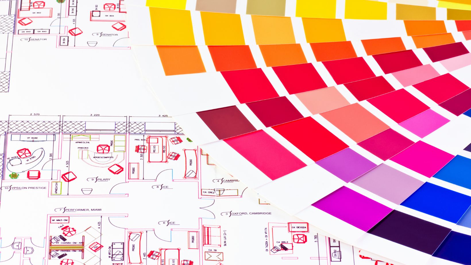
Breaking the code of color schemes begins with mastering the basics. A basic color scheme involves two or more colors that look satisfactory together, creating a cohesive and balanced feel. These include monochromatic schemes, made of tints, tones, and shades of a single hue, or complementary schemes, perfect blends of two colors on opposite sides of the color wheel.
Analogous schemes also exist, weaving a visual narrative with colors next to each other on the wheel. Triadic schemes, in contrast, boast an energetic feel using three evenly spaced colors on the wheel. Last, yet not least, square and rectangle (tetradic) schemes capitalize on the richness of four colors evenly spaced on the color wheel.
Different Aspects of Color Schemes

Continuing from the comprehensive exploration of the role and significance of color schemes in various design domains, it’s crucial to delve into the different aspects of these schemes. This includes exploring the contrast between RGB and CMYK, understanding how color temperature influences mood, and unraveling the essence of color harmony and balance.
RGB vs CMYK: Differences and Applications
Primarily, there exist two color models: RGB (Red, Green, Blue) and CMYK (Cyan, Magenta, Yellow, Black). RGB, utilized in on-screen visuals like web pages and videos, operates on the concept of additive color. Adding all colors together produces white. For example, combining red and blue results in magenta.
Contrarily, CMYK, used for print media, employs subtractive color mixing. It’s predicated on the absorption and reflection of light. Combining all colors in this model produces black, not white. For instance, blending cyan and magenta produces blue. Thus, knowing the correct model to use is vital, depending on the particular application—digital or print.
Color Harmony and Balance
Color harmony describes the theory of combining colors in design to create a pleasing aesthetic for the viewer. It’s central to good design. A good example can be found in a triadic color scheme, which uses colors equidistant on the color wheel, such as red, blue, and yellow.
Color balance, on the other hand, is the equitable distribution of colors throughout a design, achieving a visual equilibrium that’s essential for readability and user experience. It’s manifested when colors don’t compete but complement each other, as noticed in a complementary color scheme. Green text on a red background, for example, achieves this kind of balance, making the text easily readable.
Intricacies of Web Color Schemes
The power of color schemes in design can’t be overstated. They’re not merely about aesthetics but also about blending psychology to create compelling visual narratives. It’s essential to go beyond the rudimentary understanding of color schemes, delving into the specifics of color models, color temperature, and color harmony for effective communication.
Choosing the right color model depends on the application, while the manipulation of color temperature can significantly influence the mood of a design. Applying color harmony and balance leads to visually appealing and well-balanced designs. Designers can steer user responses and enrich user experiences through thoughtful color choices.
Remember, color schemes are more than just a palette; they’re a powerful communication tool. They harmonize aesthetics with psychology, playing a pivotal role in impactful storytelling and design. By mastering the intricacies of color schemes, one can truly harness their power and create designs that resonate.